In which we dive into the intricacies of data collection in software development.
Those familiar with the series can skip ahead to the next section.
For everyone else: welcome to the first part of the Toronto Fire Fan (TFF) series of posts in which I share the kinds of decisions made by senior software developers and system designers daily.
Feel free to check out the intro.
If you’re a developer looking to advance into systems design and architecture, these posts will give you a taste of some considerations you’ll want to start making.
If you’re not a developer, these posts will give you a behind-the-scenes glimpse into what the developers making your software are up to.
Toronto Fire Fan is a software that plots on a map: active incidents to which Toronto Fire Services is responding in real-time. You can check it out here.
Data Collection
Data collection sounds easy and straightforward, but as one of my mentors once said, “things in software development are rarely as straightforward as they first seem.”
First idea to ingrain in your mind: when you’re asked to gather data, you’re being asked to gather data for a specific purpose. The organization has questions, and they want data to help answer those questions. The logical conclusion is that there’s little point in gathering data unless you, clearly, know what questions need answers.
This is a critical starting point that you must get right because it heavily influences all the decisions that follow.
Next, you’ll have to determine where you’re going to get your data. In some cases, you may have to aggregate data from multiple sources. You’ll have to figure out how to do that.
Suppose you’re developing a weather app that collects data from different sources. One source tells you the amount of rain in millimeters in your area for each hour in 24 hours. The other source tells you the amount of precipitation (i.e., rain, snow, sleet, etc.) in inches per day. How do you combine all that data to get the answers you need? That can be a hefty challenge – a story for another day.
Let’s keep it simple(r) for now.
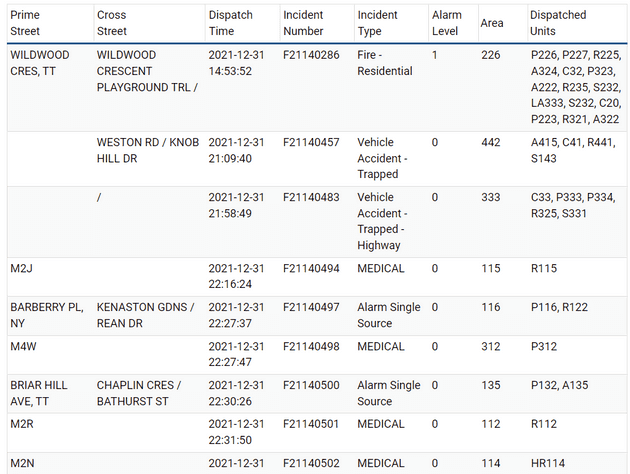
We’re only getting data from one source for the TFF project – it’s data provided to the public by the City of Toronto. Here’s a sample:
Experienced developers will immediately spot several potential challenges this data presents. That’s because experience trains developers to focus less on individual software components, and more on the broader purpose(s) of the software. With experience, you learn to connect the broader requirements with every task you must complete to attain them.
You learn to look ahead.
So, you understand how work you do further down the road impacts work you’re doing right now.
For example, suppose all we want to do is to plot these locations on a map. How do we do that?
I find it helps to work backwards from the end.
At some point, we must either create our own map or use mapping software (like Google Maps). Let’s keep it simple. Let’s not reinvent the wheel. We’ll use an existing third-party mapping software.
Now, we have other decisions to make, such as, “which mapping software should we use?” There are several factors to consider like, cost, technical constraints, usability, and even, politics. We’ll dive deeper into the intricacies of this decision in an upcoming post on third-party software.
Suppose we’re forced to use software that can only give us a map if we provide latitudinal and longitudinal (a.k.a. “lat-long”) coordinates. As you can see, the source data doesn’t have geographic coordinates. Luckily, the mapping software also has a feature that can transform freeform address text into lat-long coordinates in a process called, geocoding. Cool! Oh, and, uncool because the mapping software maker bills us for every address we need to geocode. ☹ To be fair, though, this would factor into the decision on which mapping software to use, which we’ll examine in the upcoming post.
OK, so we need to geocode each address we get. With this dataset, we’ll need to combine the “prime street” and “cross streets” into single street addresses to provide the mapping software. But look at the third row down from the top. There are no streets listed at all, which makes sense because it’s a highway accident. Moreover, the prime-cross street combinations are inconsistently formatted, which can create problems for the geocoding service. The results may be unreliable. For instance:
- In the first row, the incident occurred somewhere along the prime street between the cross streets, but the exact location is unknown.
- In the second row, only two cross streets are provided (with no prime street). One might assume that they form an intersection, and, in this example, they do, but they don’t always. Sometimes a street continues past an intersection with a different name, but that situation is listed as two cross streets. Some mapping services don’t know what to do about that.
- As I mentioned, the third row has no streets at all.
- The fourth row only has the first three characters of a postal code, which gives a general area of where a medical event occurred. This is done for privacy reasons.
- Some street combinations may exist in nearby cities.
In the case of TFF, I chose to geocode only:
- Entries with a prime street and at least one cross street,
- Entries with no prime street and at least two cross streets, and
- Entries with just the first three characters of a postal code.
The mapping software can also limit results to an area I specify, which helps eliminate results from other cities – though this was not implemented in the app as of this writing.
I’m just scratching the surface of the kinds of things senior developers think about when gathering data. Oftentimes, the data we’re given is incomplete. Often, it’s imperfect. Data collection sounds straightforward, but as my mentor said, “things in software development are rarely as straightforward as they first seem.”
There’s one more quirk about the data provider I forgot to mention. Sometimes, the data provider returns an incomplete dataset, but not in the sense I described above. You see, in order for you to see the list of active incidents on the City of Toronto’s website, your browser has to first go to a server to get the list to show on your screen. But sometimes, the list that’s returned from the server is cut off. It’s malformed. It’s like if you asked a server at a restaurant for a menu, but you get one that’s torn in two, and you only have the top part. You can identify some menu items, but not all of them. There are (complicated) ways around this beyond the scope of this post, but software automation can’t handle it. That’s why, sometimes, the City of Toronto’s website will show no active incidents even when there should be, along with a “Last Updated” time that’s curiously blank (yes, it’s because of the malformed response).
If I don’t develop a solution, then my website will have the same problem. For the sake of my website’s visitors, I devised a solution, but it involves storing the previous, well-formed response from the server. So, now we need a place to store data. Sounds straightforward, doesn’t it?
Join me in my next post as we continue this journey.
If you found this post or this series interesting, or if you know someone who might find this useful, please consider sharing it.
If you’re a developer you can now point your friends and family to this series, and go, “you see! This is what I do!”
As always, leave your questions and comments below. I’m also on Twitter (@JustSomeDev) if you’d like to chat with me there.
Thank you for reading, and I’ll see you in the next one.

